Summary #
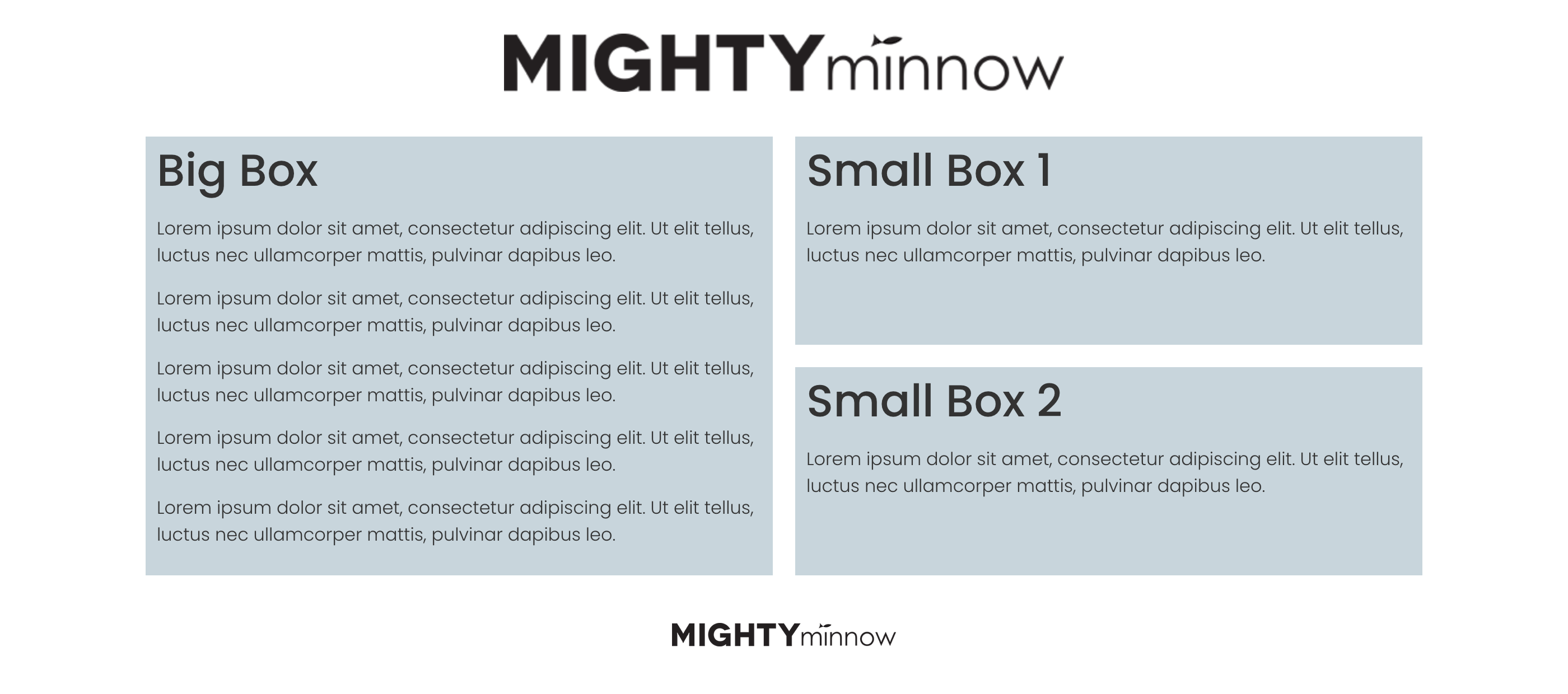
In this tutorial, we will explain how to build a two-column layout with one big box in one column and two (or more) equal-height smaller boxes in the other column.
Requirements #
The new Elementor Flexbox Containers are required for this solution. It is not compatible with the legacy Sections and Columns.
Setting the layout #
Add the Elements #
The structure for this is really simple. Just add:
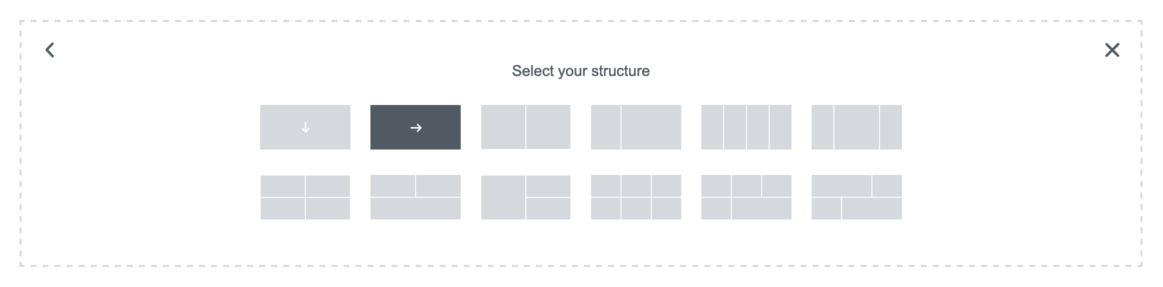
- 1 Container (Flexbox → Horizonal).
- 2 Loop Grid widgets.
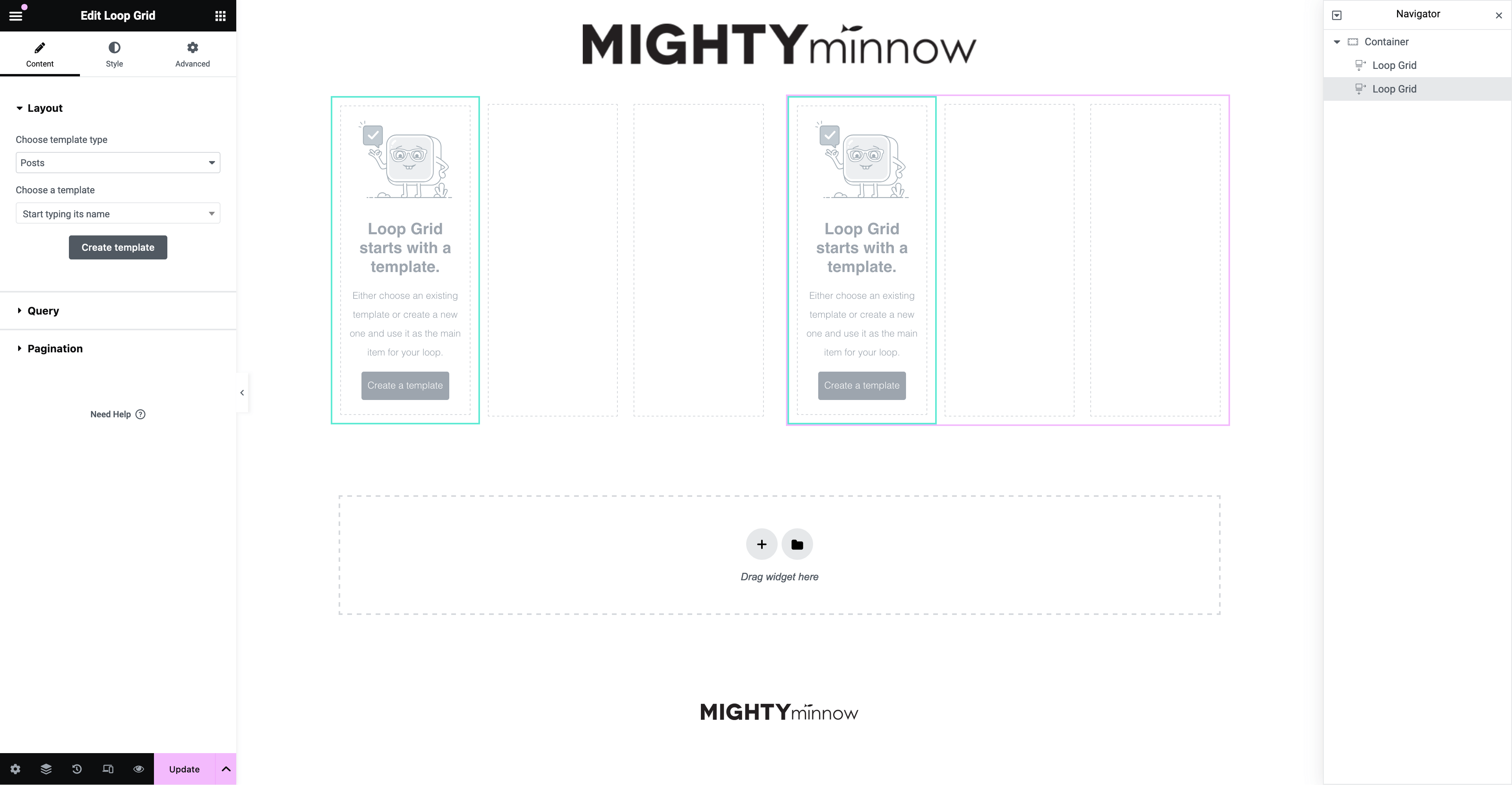
The Loop Grid widgets will automatically align to the 50% of the row. Your Elementor Editor should look like this:
And your Navigator like this:
Configure the Loop Grids #
Set the layout for each Loop Grid. You can choose an existing template or create a new template.
For this tutorial, we are creating a very simple template with a Post Title, Featured Image and Post Excerpt.
To make it a bit different, we are creating a different template without image on the second Loop Grid.
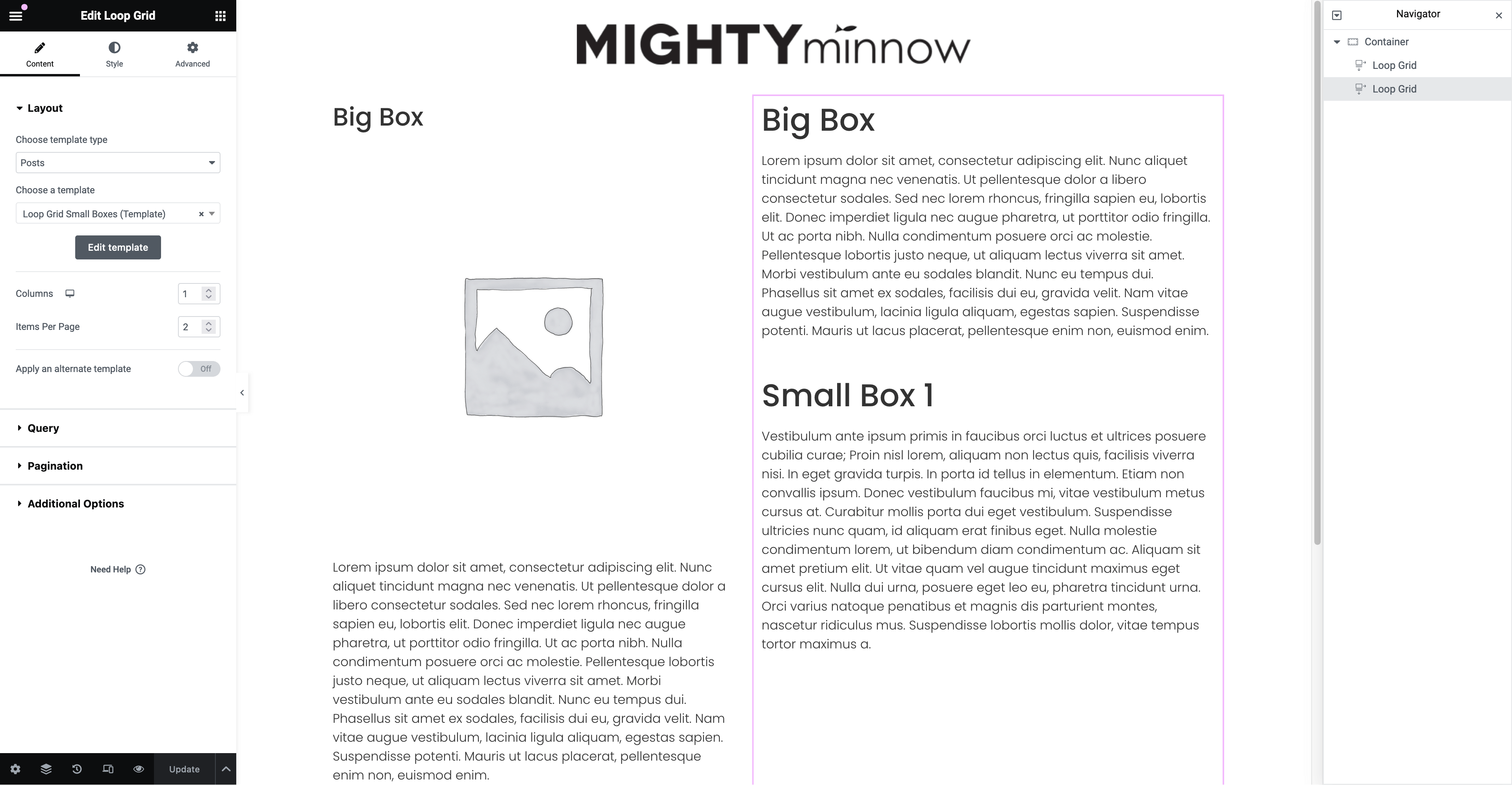
At this point, your Elementor Editor will look a bit messy like the following:
So we will change the Loop Grid → Layout → Columns from 3 to 1. Do this on both Loop Grid widgets. Confirm that Tablet and Mobile are inheriting the same settings, otherwise set them to 1 too.
Also change the Items Per Page, set 1 on the left Loop Grid and 2, 3 (o whatever you prefer) on the right Loop Grid.
Your layout should look much better at this point:
If we add some color, you will notice that the boxes are not Equal Height yet:
Unfortunately, we didn’t figure out a way to do it directly with Elementor. But that won’t stop us! Just add this Custom CSS to the Container:
@media( min-width: 768px ) {
selector .elementor-widget-loop-grid > .elementor-widget-container{
display: flex;
}
selector .elementor-widget-loop-grid > .elementor-widget-container > div > div{
display: flex;
}
}
And that’s it! Our boxes will be equal height now:
Add a class to use it anywhere #
You can use a class (.equal-height-boxes) to apply this layout to multiple sections. The class name needs to be added to the Container and the CSS can be added to the Page or Site settings.
The CSS snippet will change a bit:
@media( min-width: 768px ) {
.equal-height-boxes .elementor-widget-loop-grid > .elementor-widget-container{
display: flex;
}
.equal-height-boxes .elementor-widget-loop-grid > .elementor-widget-container > div > div{
display: flex;
}
}
Customize the Gaps #
At this point, our boxes are equal height now. But you may want to control a bit better the spacing between the columns and rows.
Desktop: Columns Gap #
To change the spacing between the columns (the 2 Loop Grids) edit this setting of the Container:
Layout → Container → Gaps → Column setting of the Container.
(Changing the Row gap doesn’t have any effect because we are only displaying 1 row on the container).
Desktop: Rows Gap #
You would think that this is controlled by the Row field beside the Column field from above, but it’s not.
To change the spacing between rows of the small boxes, edit the this setting in the second grid:
Style → Gap between rows.
(The Gap between columns doesn’t affect the layout because we are only displaying one column on this grid).
Mobile: Rows Gap #
To edit the gap between rows of the mobile version, we need to change 2 different settings:
- In the Container: Layout → Container → Gaps → Row (be sure to edit the Mobile setting only).
Note: When you edit the value of Row, the value of Column may change automatically… don’t worry, this setting is ignored as we are only displaying 1 column per row. - In the second Loop Grid: Style → Layout → Gap between rows.
Configuring the queries #
Our layout is ready at this point. But most of the times you will want to display the same post type on both columns and you will notice that the first post is repeating in the Big Box and the first Small Box.
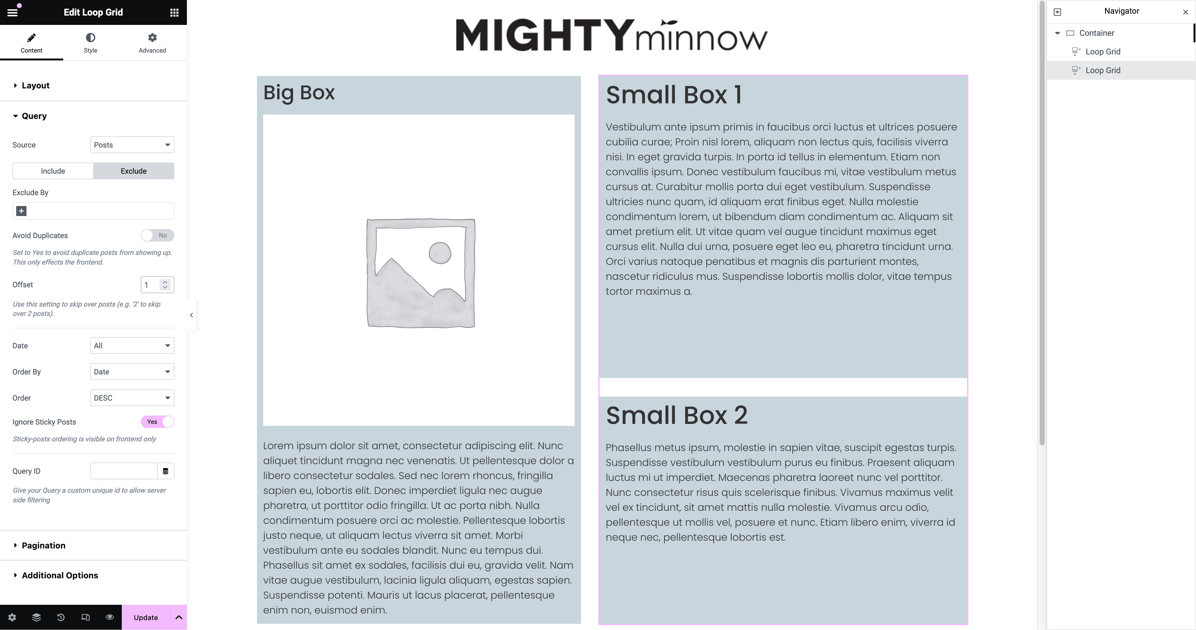
To fix this issue, edit the settings of your second Loop Grid:
Content → Query → Exclude → Offset: Change from 0 to 1.
Layout variations #
The CSS of this layout is ready to work with some variations. For example:
Big Box in the right column #
3 Small Boxes #
Here you can notice that the height of the small boxes will vary to adapt to their content, but both columns will always match.
Longer Small Boxes #
Also, if the total height of the small boxes is bigger than the height of the big box, the big box will grow to keep the same height.