
This is the continuation of “For Love. Part One.”
The Time(s)
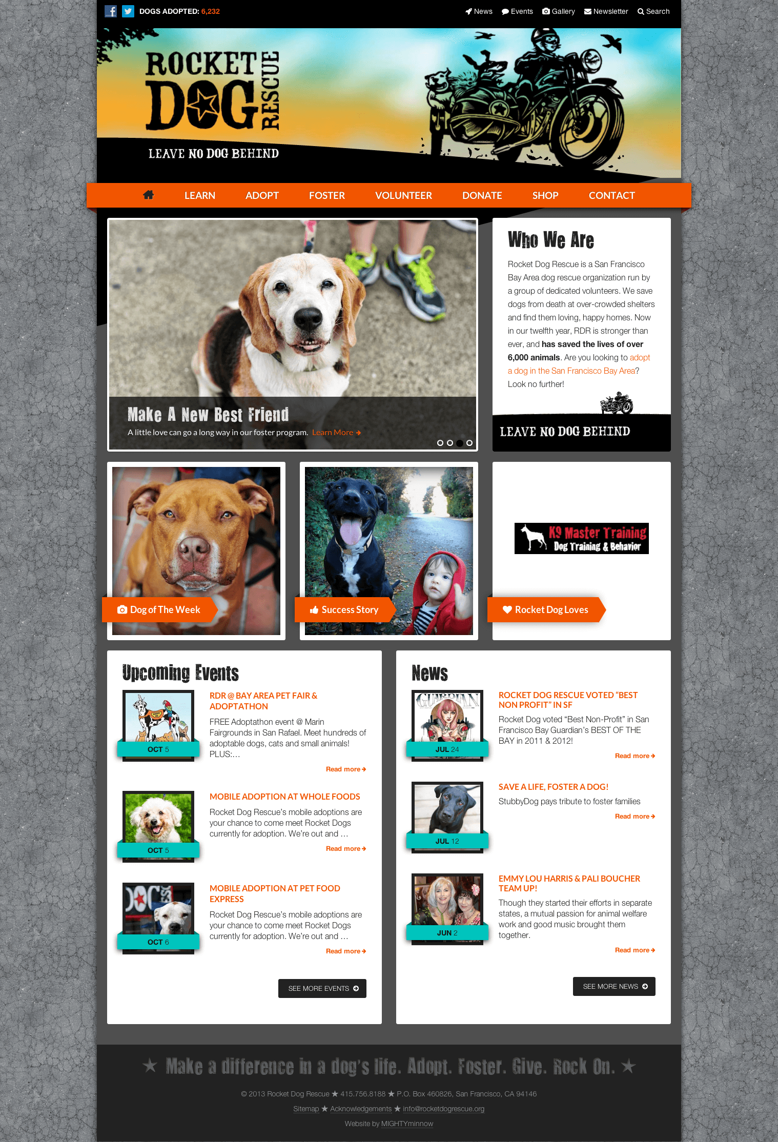
First, I’ll tell you that all told, making a new, responsive, beautiful (if we do say so ourselves) website for Rocket Dog took over 200 hours. But I’m getting ahead of myself.
The Design: Adobe Flash & Photoshop
Some time ago, we received a great Flash animation for Rocket Dog that was created by a talented designer and animator named Justin Klein. Kathy Allbright, of Allbright Design, then took that animation and created some sketches of what she thought a new website for Rocket Dog might look like, where she included Justin’s great animation in the masthead. Then time passed. Quite a bit of time, honestly, because 200+ hours (of unbillable time) is difficult to find. Unless you make it a priority. A real, concrete, front-of-the-line priority. Which is what we did, this summer. We made making Rocket Dog Rescue a shiny new website into our top priority.
The Process
Choosing Technology
Platform: WP
 At MIGHTYminnow, we like to build websites with WP. We do this because our clients find WP websites easy to maintain and we find them fun and (relatively speaking) easy to build. For some things we think other CMS’s are appropriate (or even better), but for a nonprofit like Rocket Dog Rescue, WP is the perfect solution. Using custom post types and Toolset’s Types and Views Plugin, it is easy(ish) for us to build in a structure that makes it simple for RDR volunteers to add dogs and success stories, place or remove slides on the home page slide show, feature news items and especially promote the dogs they have saved (and are trying to place) and highlight the adoption events they hold every month.
Framework: Genesis (plus Cobalt Genesis Extender)
On top of WP, we like to add the Genesis Framework. Genesis is great because it has one, two and three column layouts built in to every theme, the home page is pretty easy to lay out (especially if you add Dynamik or Genesis Extender), and many of the base themes are already responsive.
Base Theme: Genesis, but Mobile First
 All that said, one of our preferences is to have our responsive themes use media queries in a “mobile first” way, and therefore to have phones and tablets only load the styles that are relevant to them, with the style sheet defining the universal rules (that apply to all screen resolutions) first, then working its way up to rules that are specific to larger displays. Simply put: we like our theme to load as quickly and efficiently as possible, especially on mobile devices. Genesis has a base child theme that is great, but we decided to rework it to be mobile first. Enter our Genesis Mobile First Child Theme. This Genesis child theme is what we used as a basis for the Rocket Dog site, but we also made the reworked version available to our community online.
Wireframing / Designopment*
MIGHTYminnow usually follows an approach to website design and development that we call Discover * Develop * Design * Theme. In most cases we first build a website with a “brown paper wrapper” type look, holding off on colors and other design elements, and instead just focusing on getting all of the blocks in the right spots on the page. That’s step one. We then take this plain Jane website (all blocked out and signed off by the client) and we send it to a designer to create a look and feel using Photoshop. We find that giving the designer an actual website to design from makes their job easier and minimizes the number of revisions we need to make, since the layout and visual hierarchy of the page are already established. Even for responsive sites, we usually just ask our designers to submit a desktop design. We then use this base design to extrapolate mobile elements and modifications during our theming phase, working back-and-forth with the designer as needed to decide how the site will reflow on different devices and at different breakpoints.
 We followed this process to some extent with the Rocket Dog redesign, but because we were using pre-exisiting sketches from Allbright Design and because we were doing a lot of “design in browser” or “design in Live View of Dreamweaver” to style elements that were not present in the Photoshop comps, what would normally be an un-styled wireframe started to take on a design pretty early in the process. The one place we really “wireframed” before theming was on the home page, where we used Genesis Extender to lay out all of the boxes and then start feeding in the content so that we could determine how the design sketches should be adapted to the real world needs of the client. A lot of the design elements were created in tandem with the development, using a collaborative approach that allowed us to build the features and determine the design for them as we went.
The idea of designing as you go, especially as it relates to responsive breakpoints and media queries is an idea Ethan Marcotte jokingly called “designopment,” about which he says:
Our goal is to get beyond the pixel limitations of Photoshop, and begin building a design that can flex and grow inside a changing browser window, that can scale to different devices. So the development team quickly begins producing a responsive design: converting the fixed grid into a fluid one, discussing ways to flexibly handle different types of media, and then finally applying the media queries that adapt our design to different resolution ranges.
Ethan Marcotte
This is the approach that we took with the Rocket Dog Rescue redesign, and we think this approach works very well. We hope you agree, and we’d be happy to get feedback on our efforts (on behalf of the dogs). More about our process in part three of this post, coming soon…
