One of the most important visual elements of a website is the color scheme, and it can be one of the most challenging elements to get right. A site geared at the elderly calls for a completely different color scheme than a site geared at children. And likewise, a site focused on serious issues, like health or social change will likely have different colors than a fan site for Bronies. Not only that, but if you’re working on a site for an international client, understanding a color’s cultural meaning is important. For example, using green in a site for the Western world may signify wealth or freshness, while in Chinese cultures, green may signify exorcism or infidelity according to About.com’s Visual Color Symbolism Chart.
In this post, I’d like to discuss a bit of basic color theory, and few tools we can use to get started in choosing the right color scheme for your next website project.
Choosing a Base Color
First, let’s assume that you already have a logo to work with. Why? Well, having a logo as a starting place makes it a lot easier to choose a base color. A good designer will have already narrowed the logo down to one to three colors, and those colors should already be doing a good job communicating the appropriate message to the target audience. So from there, we can analyze the logo and decide which color acts as the main color, and whether that works as a main color accent in our web design.
Let’s look at an example.
We recently completed a site design for the Piedmont Education Foundation. Our client provided us with a logo, which was purple and white. Straight away, it was easy to tell that our base color for the project would be purple, but how did we come up with the other colors in the project?
Choosing a Supporting Cast of Color
One of my absolute favorite tools for choosing color schemes is Adobe Color CC. You have a few different options for getting started, so let’s go!
Choosing a Color Scheme from a Base Color
-
- For this example, let’s start with a warm, sunny orange. Go to http://color.adobe.com and plug that hex for our sunny orange (#ff6500) into the middle box, and make sure the white base color triangle is in that box (if it isn’t, hover over the bottom area of the box until the tool tip pops up, and click Set Base Color).
- Now, let’s select a color rule from the upper left side of the screen. What do these color rules mean? Well, here’s a brief overview:
- Analogous
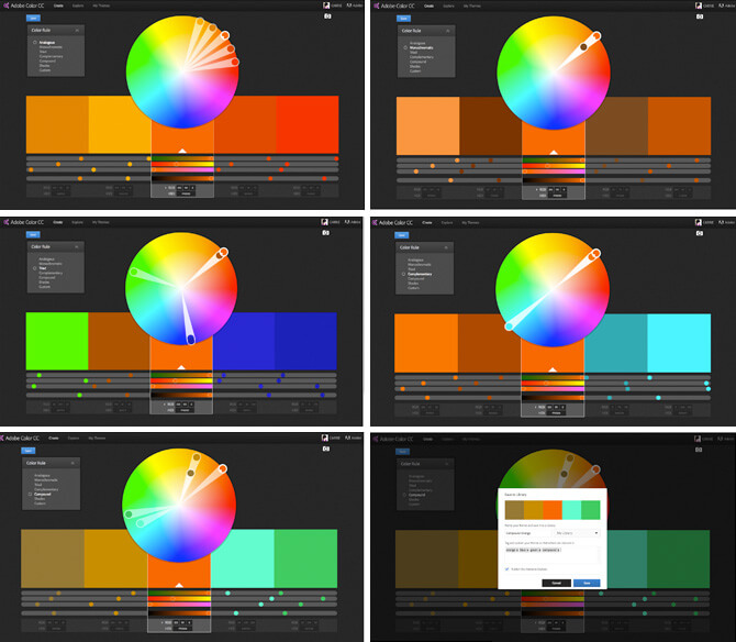
Analogous colors are three or more neighboring colors on the color wheel. Since we selected orange in this example, we should see yellow, yellow-orange, orange, red-orange, and red in our color swatches. - Monochromatic
Normally, monochromatic colors are versions of our base color with black, gray, or white added to create variations of the color, but Adobe Color CC appears to use saturation (how bright, or how rich a color appears) as way to affect color for the monochromatic scheme. - Triad
A triad scheme uses colors that are an equal distance from one another on the color wheel. The result you see may be less than lovely now, but with a bit of finessing, you can get some great results from a triad color scheme. Try pulling the dot sliders in toward the center of the color wheel, or adjusting the bottom slider under a color to add more gray or black to a color. - Complementary
Complementary colors are two colors that are directly across one another on the color wheel. A good rule of thumb when using complementary colors is that the complement should have a contrasting level of saturation, or perceived brightness. Otherwise, the complementary colors will clash too much when used together. To adjust the saturation in Adobe Color CC, simply drag the color dot toward the center of the color wheel. - Compound
In Adobe Color, a compound color scheme is a mash-up of a complementary and analogous color scheme explains Tony Harmer in The Design Jungle, an Adobe blog and design resource. In our example, it is finding the complement to the orange (blue), grabbing one color that is analogous to the blue (green), and two colors that are analogous to the original orange (two desaturated yellow-oranges). - Shades
Shades are fairly straightforward, and simply show different amounts of black mixed into the originating color. What’s fascinating is that adding a lot of black to yellow can actually turn it green!
Left-to-right, top-to-bottom: an analogous scheme, a monochromatic scheme, a triad scheme, a complementary scheme, a compound scheme, and saving a scheme.
- Analogous
- If you have an Adobe CC account, then you can log in and save the color scheme to the Creative Cloud library. This is particularly useful if you are going to work in Illustrator, Photoshop, or any of the Adobe apps on the iPhone or iPad because you will have access to your scheme (trust me, this is super helpful when you’re working on a logo in Illustrator!)
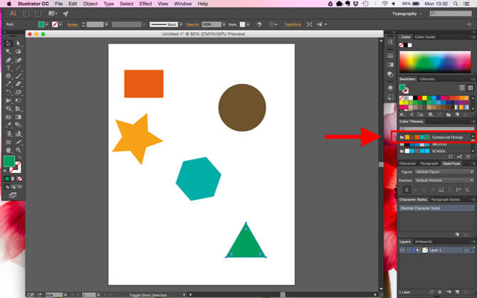
I like the compound color scheme best, so I am going to go ahead and save that. Click the Save button in the upper left corner. - In the pop-up box, enter a name for your color scheme, indicate where you’d like to store it in the cloud, and add any tags you’d like to describe your color scheme. You can also indicate whether you’d like to theme Published to Explore, which will make it viewable by the public (it may be worth being careful here if you are creating a scheme for a client project).
- Now you can fire up Illustrator, and see your new color scheme in the Color Themes panel!

Choosing a Color Scheme from a Photograph
What if you don’t have a color scheme? Maybe you’ve been tasked with the logo design, and are looking for inspiration for the color scheme based on the content you’ve already received from the client (like a photograph), or you’ve worked with the client on a moodboard, and want to grab colors from there. Well, you’re in luck. Adobe Color has an option to upload a photo and choose a color scheme from there!
- Go to the Adobe Color website, and click the camera icon in the upper right of the screen.
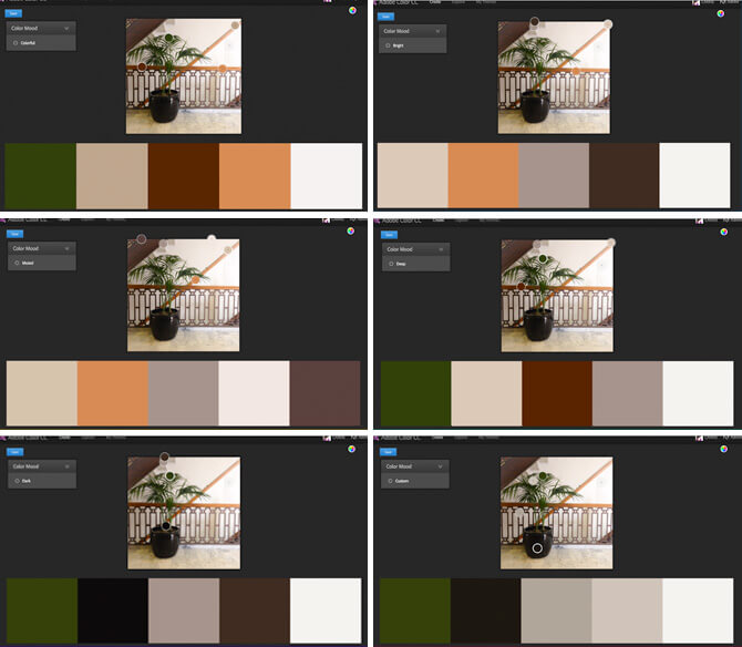
- Use select an image from your computer. For this example, I’m going to use a photo of our gorgeous office building.
- Not unlike the previous method for choosing a color scheme, you can choose different “moods” based on the colors in your photograph.
- If you choose Custom, then you can drag the dots around to customize the color scheme based on the image. I wanted a calming vibe with a single pop of color, so I moved my dots around to get some warm grays into the mix.

Using either of these methods for choosing a color scheme may not work perfectly, and you may need to consider finessing the scheme in another program, like Adobe Illustrator. The key here is to find a starting point, and use that to guide you in the color-choosing process.
