If you use Mailchimp to send emails to your clients and customers, you may have become very lost when you most recently logged in! Mailchimp redesigned their interface in June, which is optional until July 15th. So, what’s great and different in the new Mailchimp?
Design
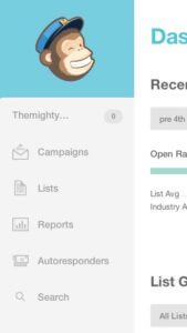 Mailchimp’s new design is much simpler than before. The designers took out as much clutter as possible which allows the user to focus on building, sending, and analyzing campaigns. When we first opened the new Mailchimp, we were a little confused about where everything was, but have found that the new design much easier to navigate and find your tools.
Tools for Teamwork
The new tools Mailchimp has created for collaborating on campaigns are pretty awesome. We have been trying them out around our office and have found them very helpful. When writing/editing a newsletter, you can comment on different sections to let your team know what you would like change. You can also write comments when sending test emails to your teammates.
Responsive-ness
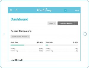 Mailchimp has made it much easier to work on your tablet. By making their Mailchimp responsive, they have eliminated the need to pinch and zoom with your fingers that can often be frustrated when trying to get something done on the go.
Subscriber Profiles
The layout of the subscriber profiles have changed pretty drastically. There is much more functionality within the subscriber lists which means getting work done faster and more easily! When scrolling horizontally through your lists, the user’s email is now always visible so you don’t lose track of which line you are on. You can also move around, hide, and toggle columns for a faster workflow.